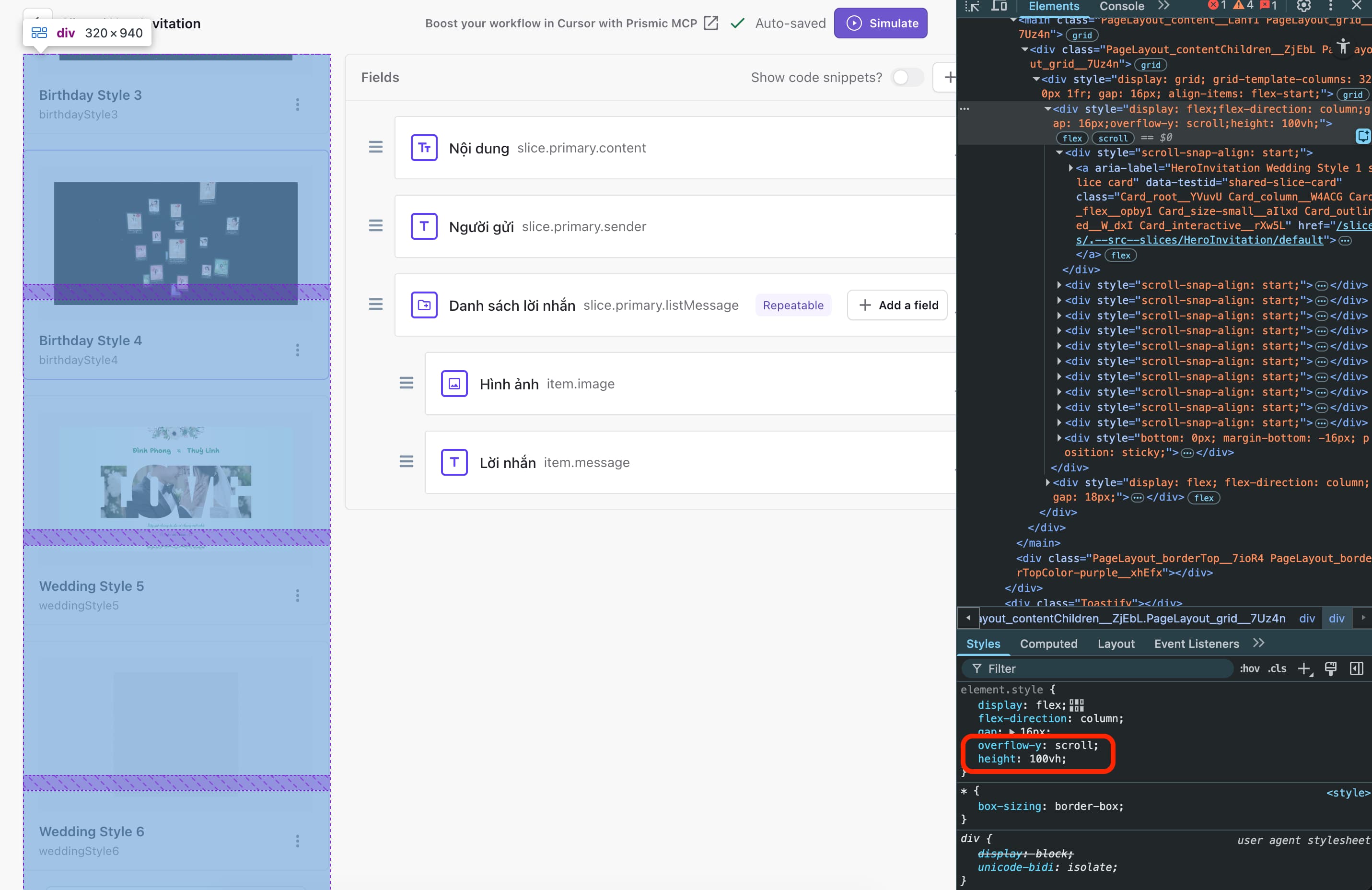
I have many variations in the slice. Currently, I have to scroll, and it’s quite hard to see some fields on the right section — it feels like bad UX. I just added some CSS styling to keep the variation list on the left. I hope the Prismic team will add this as a default style in the next version.